Unless you are new to the concept of building graphical user interfaces (which is fine), the general role of the WPF controls should not raise too many issues. Regardless of which GUI toolkit you might have used in the past (e.g., MFC, Java AWT/Swing, Windows Forms, VB 6.0, Mac OS X [Cocoa], or GTK+/GTK#), the core WPF controls listed in Table 28-1 are likely to look familiar.
Table 28-1. The Core WPF Controls
| WPF Control Category | Example Members | Meaning in Life |
|---|---|---|
| Core user input controls | Button, RadioButton, ComboBox, CheckBox, Calendar, DatePicker, Expander, DataGrid, ListBox, ListView, Slider, ToggleButton, TreeView, ContextMenu, ScrollBar, Slider, TabControl, TextBlock, TextBox, RepeatButton, RichTextBox, Label | WPF provides an entire family of controls you can use to build the crux of a user interface. |
| Window and control adornments | Menu, ToolBar, StatusBar, ToolTip, ProgressBar | You use these UI elements to decorate the frame of a Window object with input devices (such as the Menu) and user informational elements (e.g., StatusBar and ToolTip). |
| Media controls | Image, MediaElement, SoundPlayerAction | These controls provide support for audio/video playback and image display. |
| Layout controls | Border, Canvas, DockPanel, Grid, GridView, GridSplitter, GroupBox, Panel, TabControl, StackPanel, Viewbox, WrapPanel | WPF provides numerous controls that allow you to group and organize other controls for the purpose of layout management. |
A majority of these standard WPF controls have been packaged up in the System.Windows.Controls namespace of the PresentationFramework.dll assembly. When you build a WPF application using Visual Studio 2010, you will find most of these common controls contained in the Toolbox, provided you have a WPF designer open as the active window (see Figure 28-1).
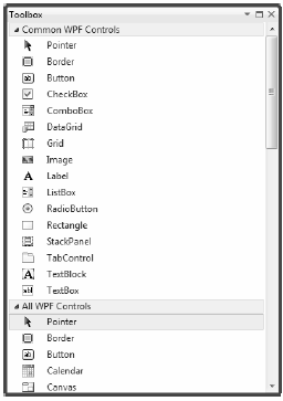
Figure 28-1 The Visual Studio 2010 Toolbox exposes the intrinsic WPF controls
Much as you can with a Windows Forms application, you can drag these controls onto the WPF window designer and configure them using the Properties window (which you learned about in the previous chapter). While Visual Studio 2010 will generate a good amount of the XAML on your behalf, it is not uncommon to edit the markup yourself manually. Let’s review the basics.
You might recall from Chapter 27 that when you place a WPF control onto the Visual Studio 2010 designer, you want to set the x:Name property through the Properties window because this allows you to access the object in your related C# code file. You might also recall that you can use the Events tab of the Properties window to generate event handlers for a selected control. Thus, you could use Visual Studio to generate the following markup for a simple Button control:
<Button x:Xame="btnMyButton" Content="Click Me!" Height="23" Width="140"
    Click="btnMyButton_Click" />
Here, you set the Content property of the Button to a simple string. However, thanks to the WPF control content model, you could fashion a Button that contains the following complex content:
<Button x:Name="btnMyButton" Height="121" Width="156" Click="btnShowDlg_Click">
    <Button.Content>
        <StackPanel Height="95" Width="128" Orientation="Vertical">
            <Ellipse Fill="Red" Width="52" Height="45" Margin="5"/>
            <Label Width="59" FontSize="20" Content="Click!" Height="36" />
        </StackPanel>
    </Button.Content>
</Button>
You might also recall that the immediate child element of a ContentControl-derived class is the implied content; therefore, you do not need to define a <Button.Context> scope explicitly when specifying complex content. You could simply author the following:
<Button x:Name="btnMyButton" Height="121" Width="156" Click="btnShowDlg_Click">
    <StackPanel Height="95" Width="128" Orientation="Vertical">
        <Ellipse Fill="Red" Width="52" Height="45" Margin="5"/>
        <Label Width="59" FontSize="20" Content="Click!" Height="36" />
    </StackPanel>
</Button>
In either case, you set the button’s Content property to a <StackPanel> of related items. You can author this sort of complex content using the Visual Studio 2010 designer, as well. Once you define the layout manager, you can select it on the design to serve as a drop target for the internal controls. At this point, you can edit each using the Properties window.
You should also be aware that the Document Outline window of Visual Studio 2010 (which you can open using the View > Other Windows menu) is useful when designing a WPF control that has complex content. Notice in Figure 28-2 how the logical tree of XAML is displayed for the Window you are building. If you click any of these nodes, you can get a preview of the selected item.
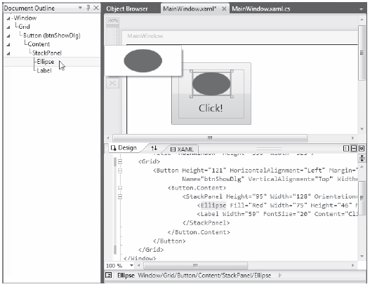
Figure 28-2 The Visual Studio 2010 Document Outline window can help you navigate complex content
In any case, once you define the initial markup, you are free to open the related C# code file to add your implementation logic:
private void btnShowDlg_Click(object sender, RoutedEventArgs e)
{
    MessageBox.Show("You clicked the button!");
}
The first part of this chapter uses Visual Studio 2010 to build the UIs of the example projects. The chapter will point out additional features as necessary, but make sure you take some time to explore the options of the Properties window and designer functionality. Later in this chapter, you will use Expression Blend to build your UIs. As you will see, Blend has many integrated tools that generate a majority of the required XAML automatically.
In addition to the common WPF controls listed in Table 28-1, WPF defines additional controls for working with the digital Ink API. This aspect of WPF development is useful during tablet PC development because it lets you capture input from the stylus. However, this is not to say a standard desktop application cannot leverage the Ink API because the same controls can capture input using the mouse.
The System.Windows.Ink namespace of PresentationCore.dll contains various Ink API support types (e.g., Stroke and StrokeCollection); however, a majority of the Ink API controls (e.g., InkCanvas and InkPresenter) are packaged up with the common WPF controls under the System.Windows.Controls namespace in the PresentationFramework.dll assembly. You’ll work with the Ink API later in this chapter.
WPF also provides controls for advanced document processing, allowing you to build applications that incorporate Adobe PDF-style functionality. Using the types within the System.Windows.Documents namespace (also in the PresentationFramework.dll assembly), you can create print-ready documents that support zooming, searching, user annotations (sticky notes), and other rich text services.
Under the covers, however, the document controls do not use Adobe PDF APIs; rather, they use the XML Paper Specification (XPS) API. To the end user, there will really appear to be no difference because PDF documents and XPS documents have an almost identical look-and-feel. In fact, you can find many free utilities that allow you to convert between the two file formats on the fly. You’ll work with some aspects of the document controls in an upcoming example.
WPF also provides you with a few common dialog boxes such as OpenFileDialog and SaveFileDialog. These dialog boxes are defined within the Microsoft.Win32 namespace of the PresentationFramework.dll assembly. Working with either of these dialog boxes is a matter of creating an object and invoking the ShowDialog() method:
using Microsoft.Win32;
namespace WpfControls
{
    public partial class MainWindow : Window
    {
        public MainWindow()
        {
            InitializeComponent();
        }

        private void btnShowDlg_Click(object sender, RoutedEventArgs e)
        {
            // Show a file save dialog.
            SaveFileDialog saveDlg = new SaveFileDialog();
            saveDlg.ShowDialog();
        }
    }
}
As you would hope, these classes support various members that allow you to establish file filters and directory paths, and gain access to user-selected files. You will put these file dialogs to use in later examples; you will also learn how to build custom dialog boxes to gather user input.
Despite what you might be thinking, the intent of this chapter is not to walk through each and every member of each and every WPF control. Rather, you will receive an overview of the various controls with an emphasis on the underlying programming model and key services common to most WPF controls. You will also learn how to build UIs with Expression Blend and Visual Studio 2010.
To round out your understanding of the particular functionality of a given control, be sure to consult the .NET Framework 4.0 SDK documentation—specifically, the Control Library section of the help system, which you can find under Windows Presentation Foundation > Controls (see Figure 28-3).
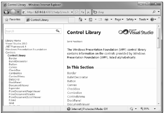
Figure 28-3 The full details of each WPF control are just a keypress away (F1)
Here you will find full details of each control, various code samples (in XAML, as well as C#), and information regarding a control’s inheritance chain, implemented interfaces, and applied attributes.